Brand identity
OKO Talent, Brand identity

Brief
OKO Talent is a web application that helps employers find qualified people, a place where an open position meets someone who can actually fill it. The name comes from the Nahuatl word for torch, and that image carried the whole brief: the light that leads talent to the right opportunity. What was needed was a primary logo and, with it, an icon version that survives on a phone home screen, where the whole brand shrinks to a rounded square.
Approach
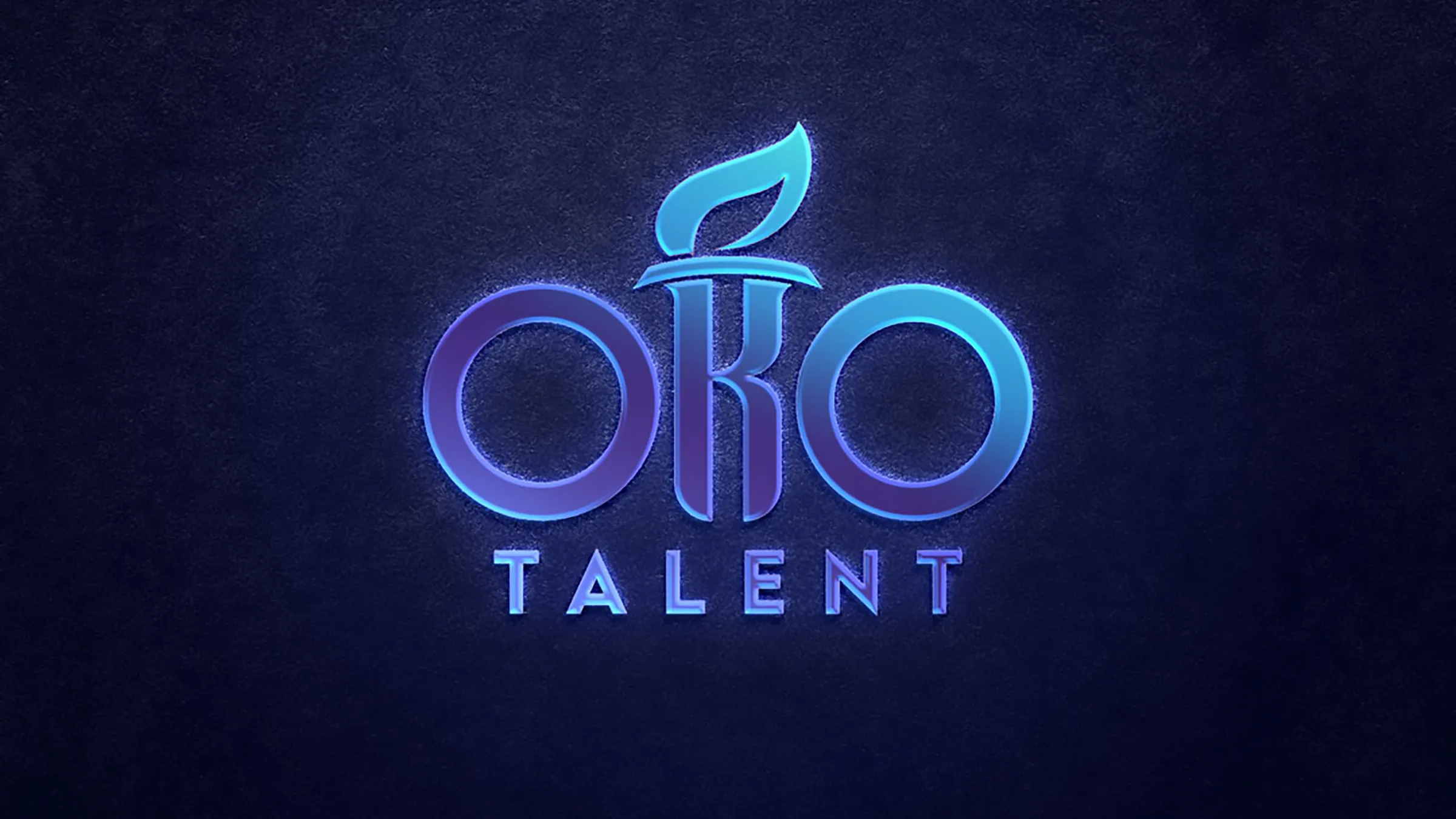
Rather than setting a torch next to the name, the torch was built into it. The K sits between the two O’s and its stem became the handle, the crossbar became the bowl, and the flame rises out of the letter itself, so the symbol and the wordmark are one shape instead of a mark plus a logotype. The whole thing is constructed with a firm sense of geometry: the two O’s are true circles of the same weight, and the K is drawn against that circular grid, which keeps the rhythm even and the logo steady at any size. TALENT is set below in widely spaced caps, quiet enough not to compete with the torch. Colour splits the work: warm red and orange for the flame, cool silver with a gold-tinted highlight for the letters, on the navy the application already used.
Result
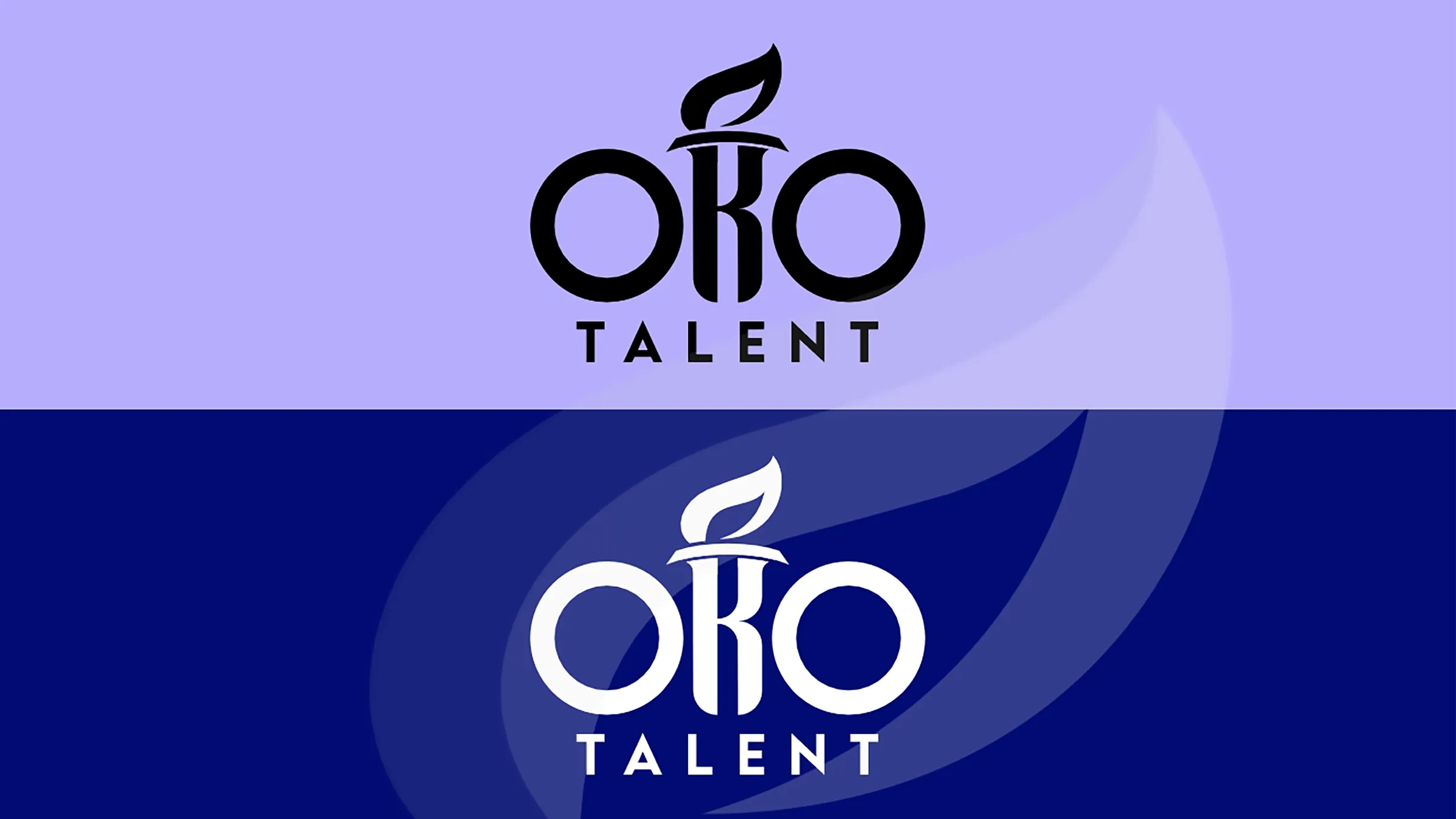
One shape that works in several states. Positive and negative single-colour versions hold up wherever colour is not available, the icon tightens the letters and the torch into the rounded square and stays recognizable at the smallest size a phone will draw it, and a lit variant is ready for the dark interface. The brand is legible from a landing page headline down to a favicon, without redrawing anything.