Packaging
CarePRO Pet Nutrition, Packaging
Brief
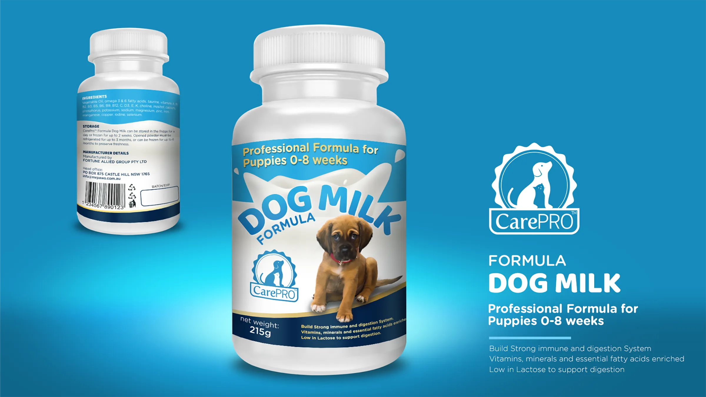
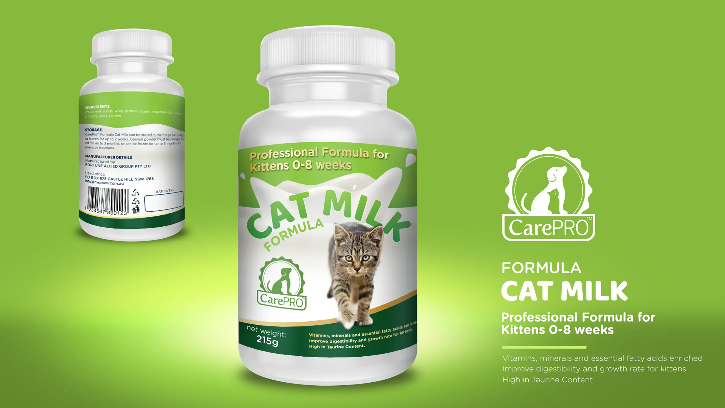
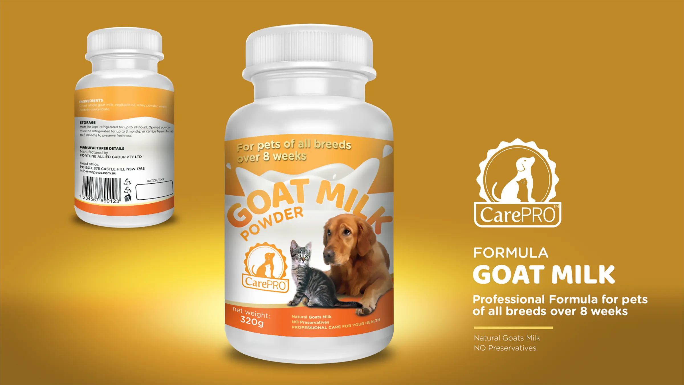
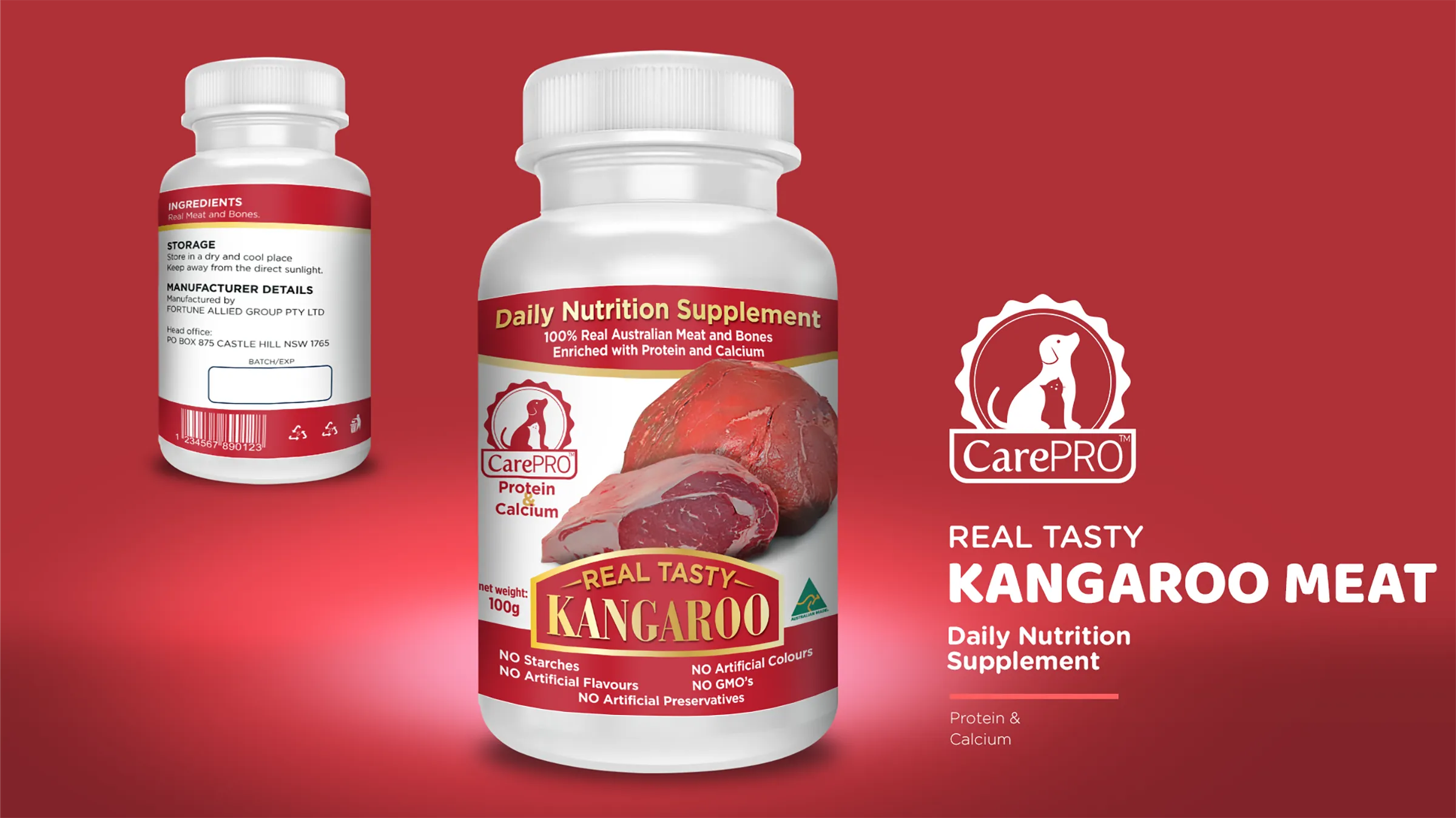
CarePRO sells nutrition for dogs and cats split by species and age: milk formula for puppies and for kittens in the first eight weeks, goat milk powder for pets of all breeds over eight weeks, and a daily kangaroo meat supplement. The packaging had to be recognized instantly on a shelf full of competitors, hold the four products together as one line while keeping each of them distinct, and still carry all the mandatory information legibly.
Approach
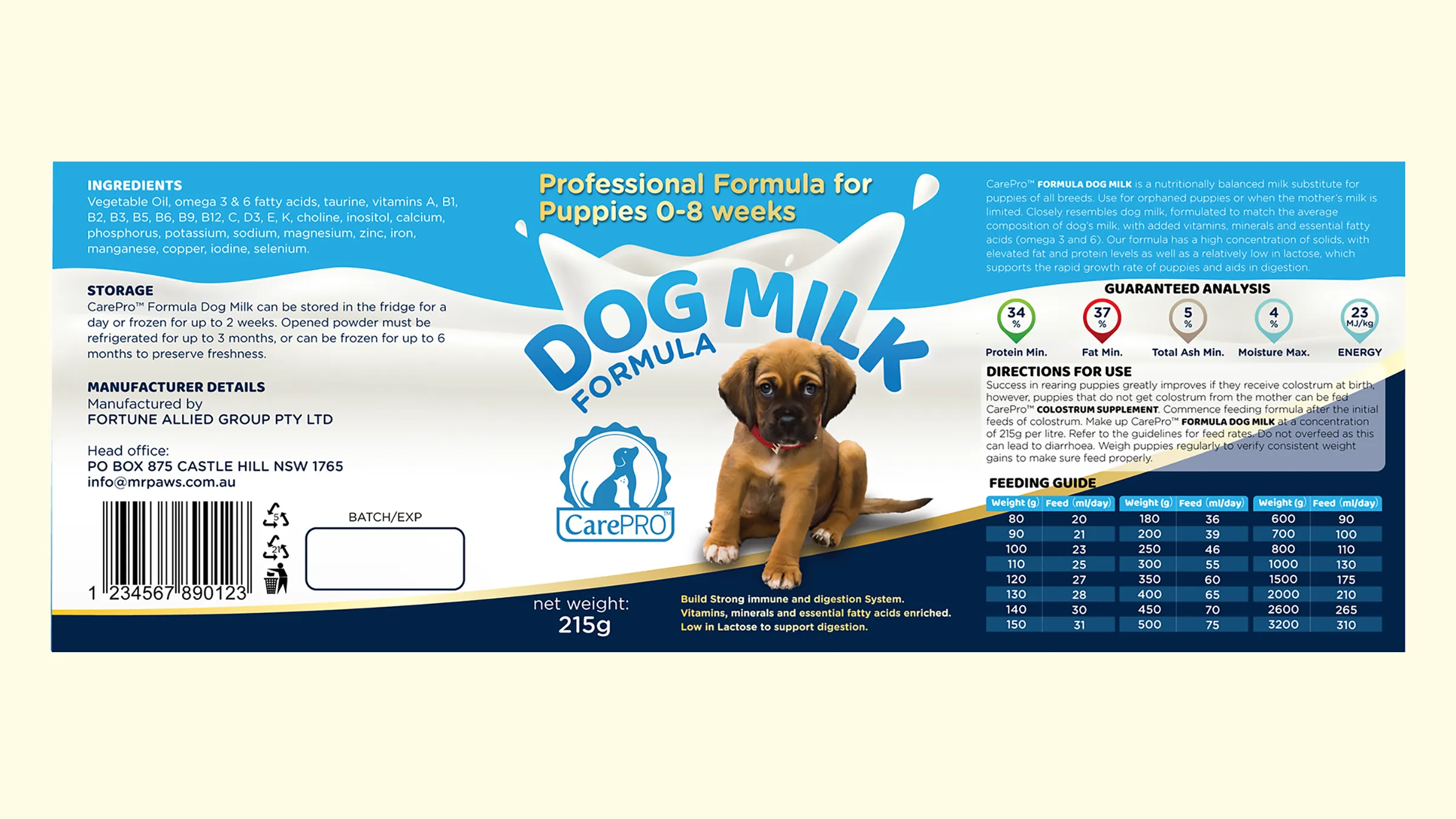
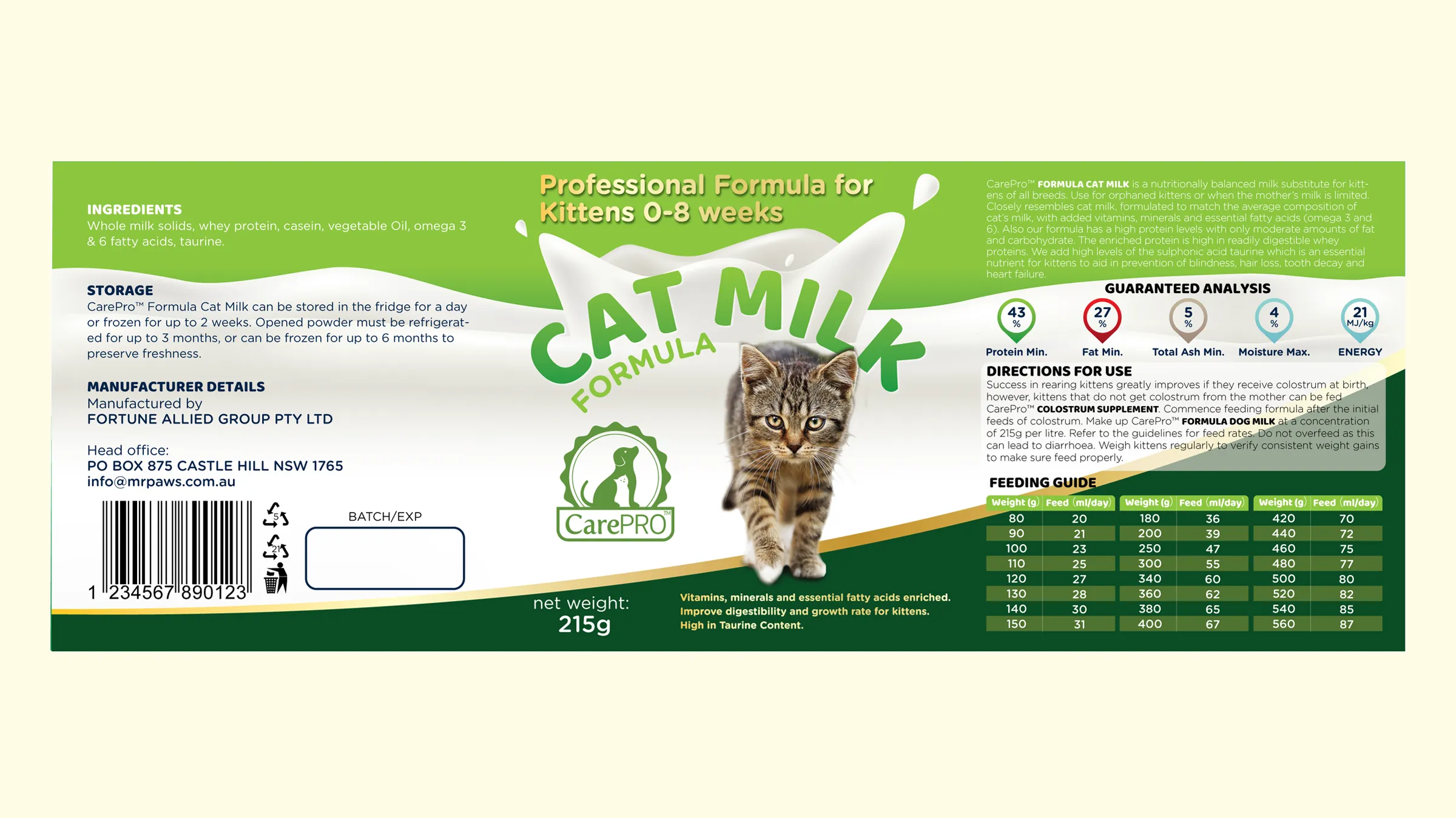
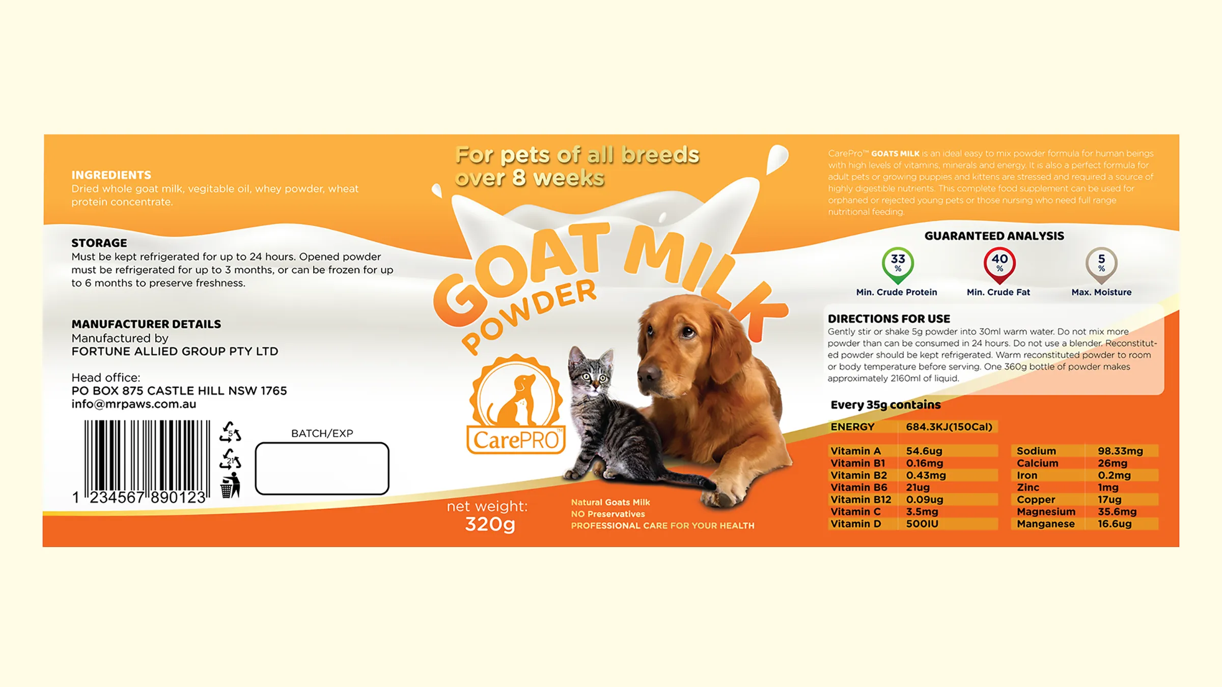
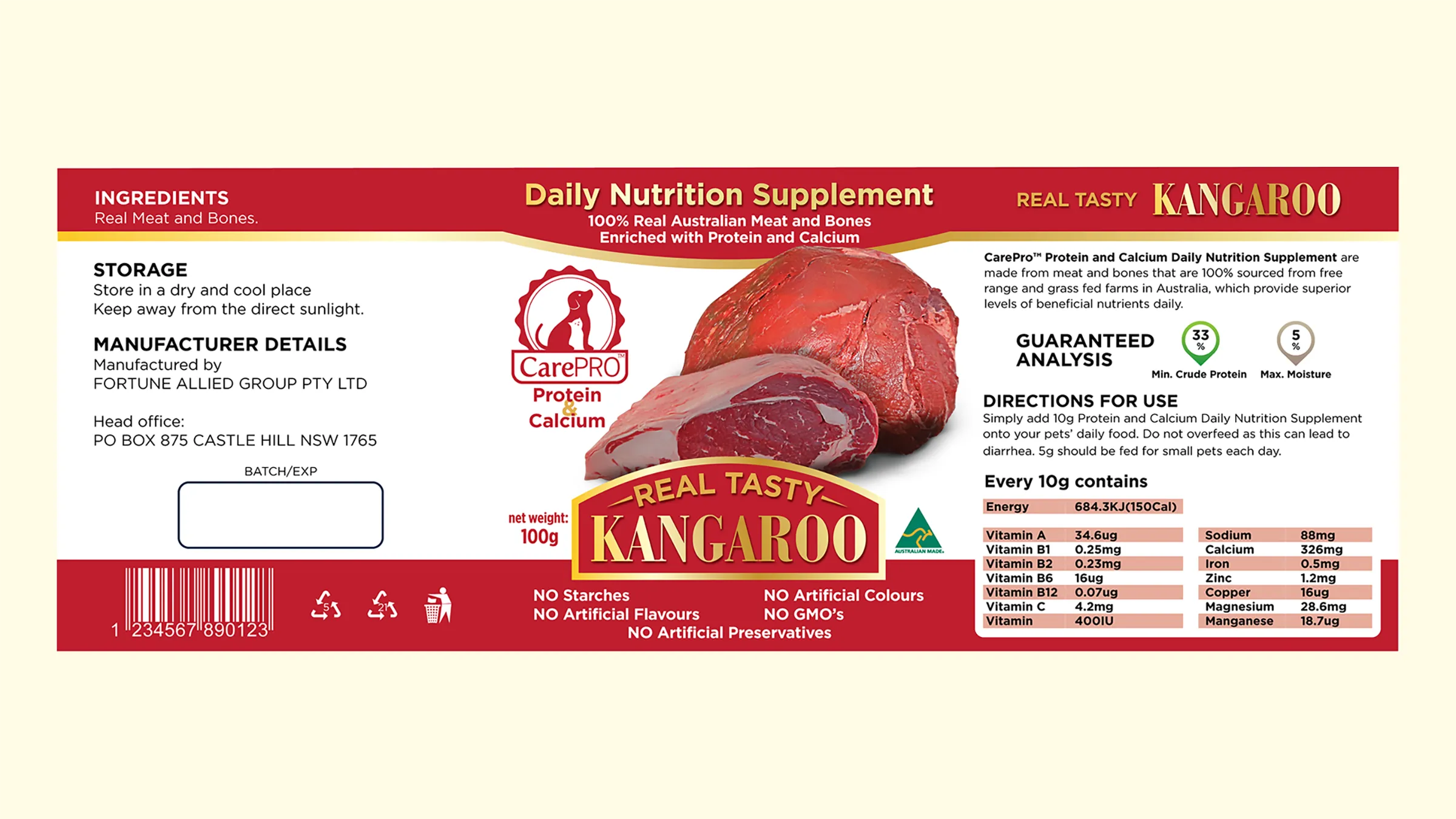
The line logo came first: a dog and a cat inside a scalloped seal above the wordmark, drawn to work in a single colour at small sizes so it can take the colour of whichever variant it sits on. Each product then got a strong colour of its own, blue for puppies, green for kittens, orange for goat milk, red for the kangaroo supplement, and that colour is the only thing that changes position to position. The target and age claim runs in the top band, the product name sits in the milk splash, the seal holds the lower left, and net weight with the key claims sits on the dark band at the foot. The backs follow the same grid across the range: ingredients, storage, manufacturer details, and for the milk formulas the guaranteed analysis and the feeding table. Everything was drawn in Illustrator, with photography and product renders finished in Photoshop.
Result
The colours are deliberately loud, they are what wins the shelf from a distance, and the fixed positions are what keep four loud packages reading as one line. Because the layout is locked and only the colour and the photograph carry the variant, extending the range does not mean designing the packaging again.