Print production
The Curator's Eye, Print production
Brief
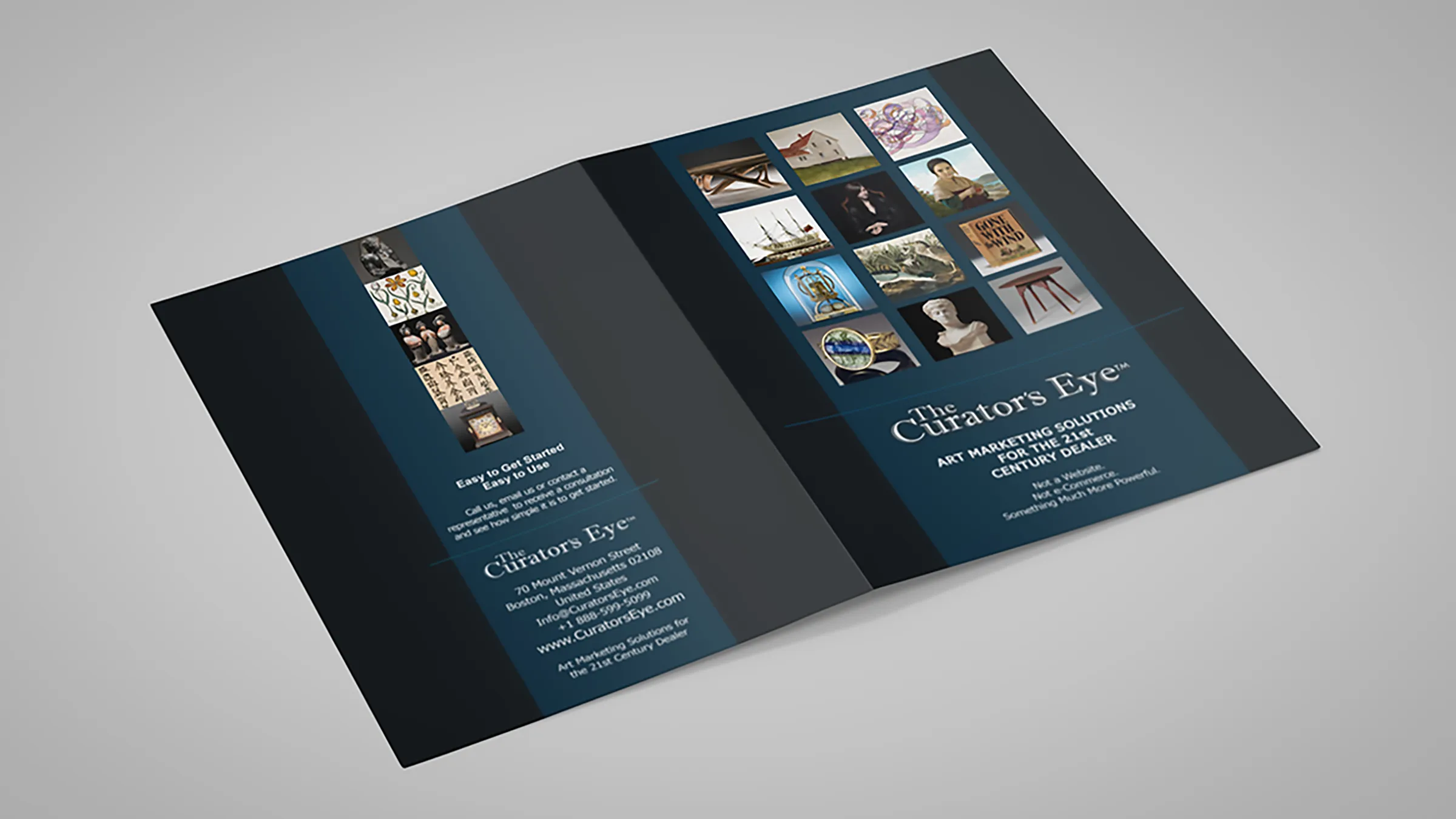
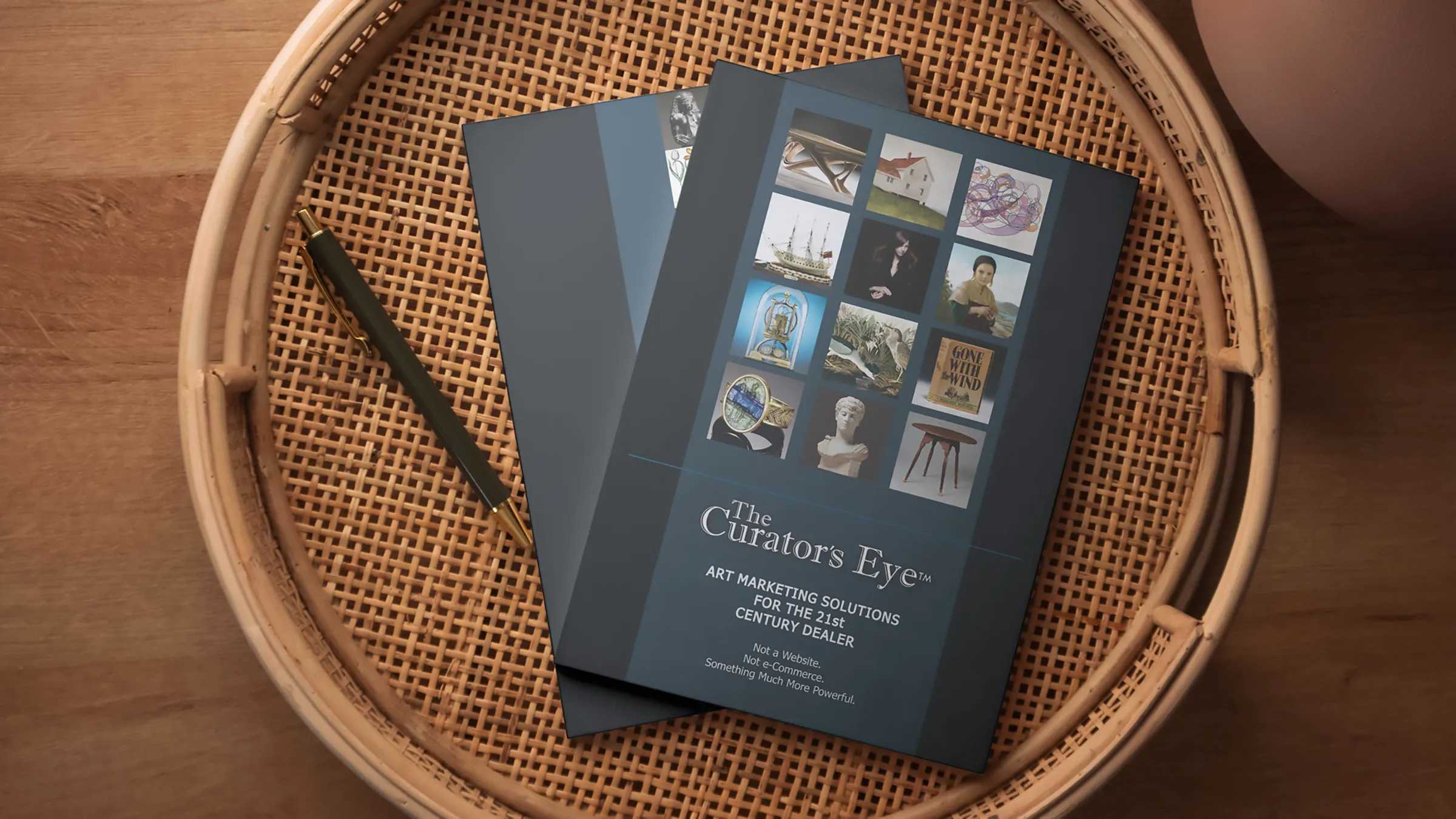
The Curator’s Eye is an online art marketing platform from Boston that connects antique and art dealers with collectors. The cover states what it is by stating what it is not: not a website, not e-commerce. That was the challenge. The service is easily mistaken for an online shop, so the material had to explain how it differs from the auction houses and from a dealer’s own site, what a dealer gets from it and what it costs.
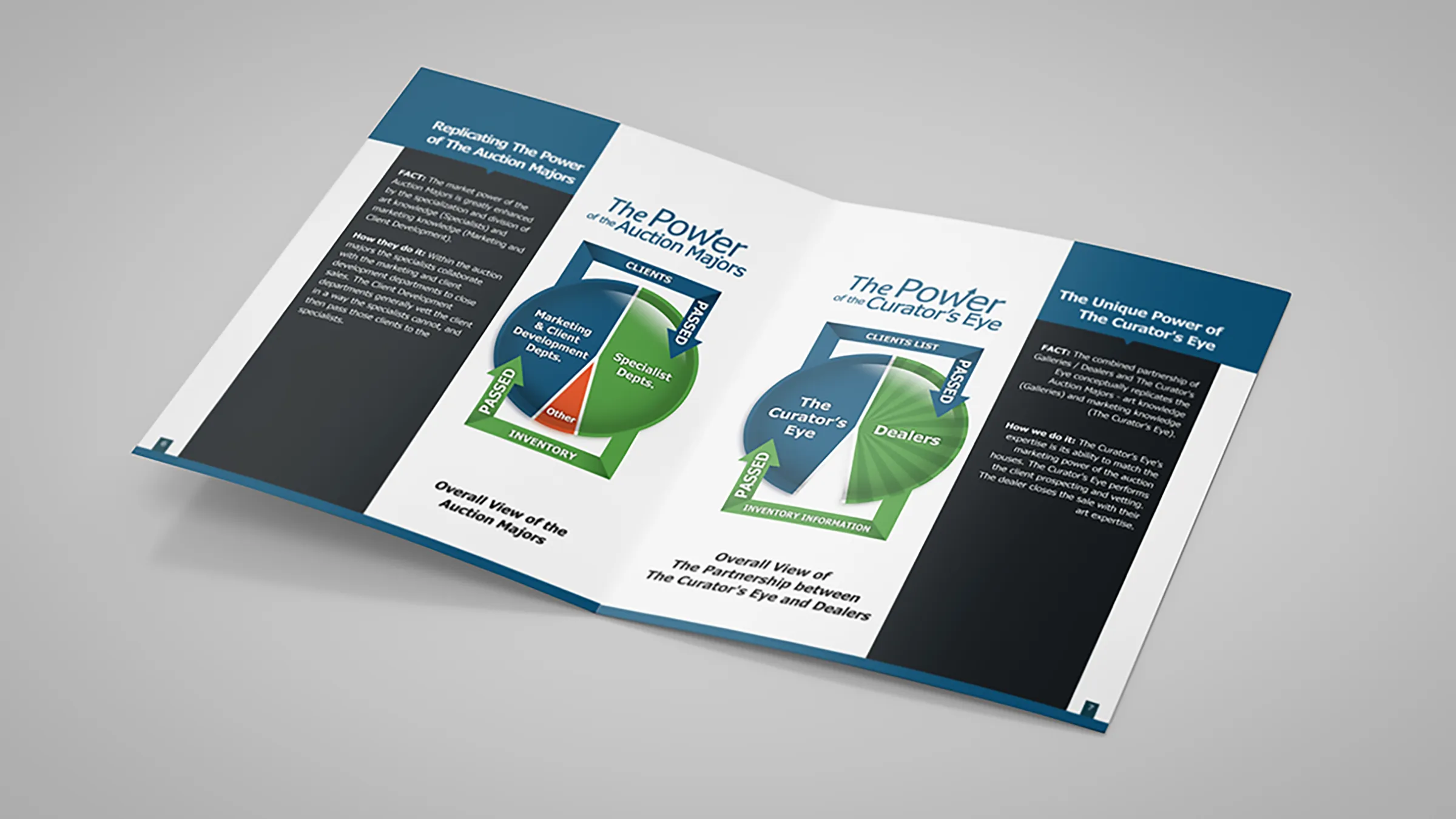
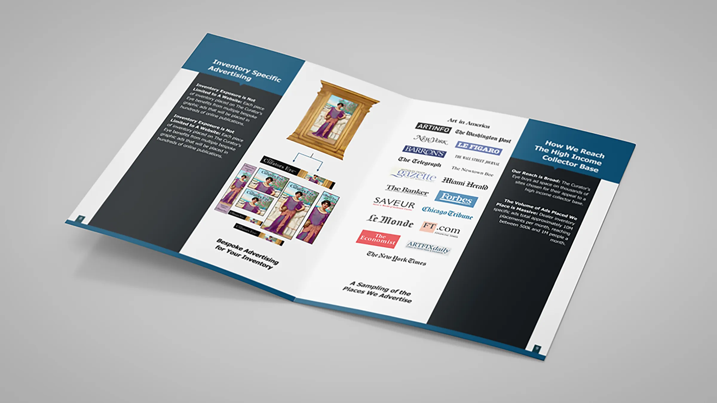
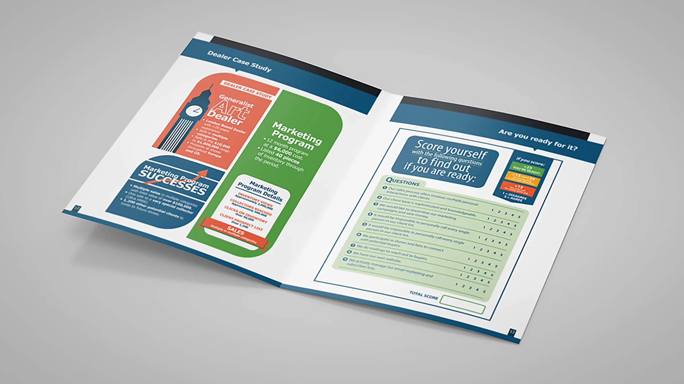
The diagrams and infographics that carry the argument were supplied by the client, already designed. The task was to fit those finished parts into a design of my own, so that everything comes together as a single design solution.
Approach
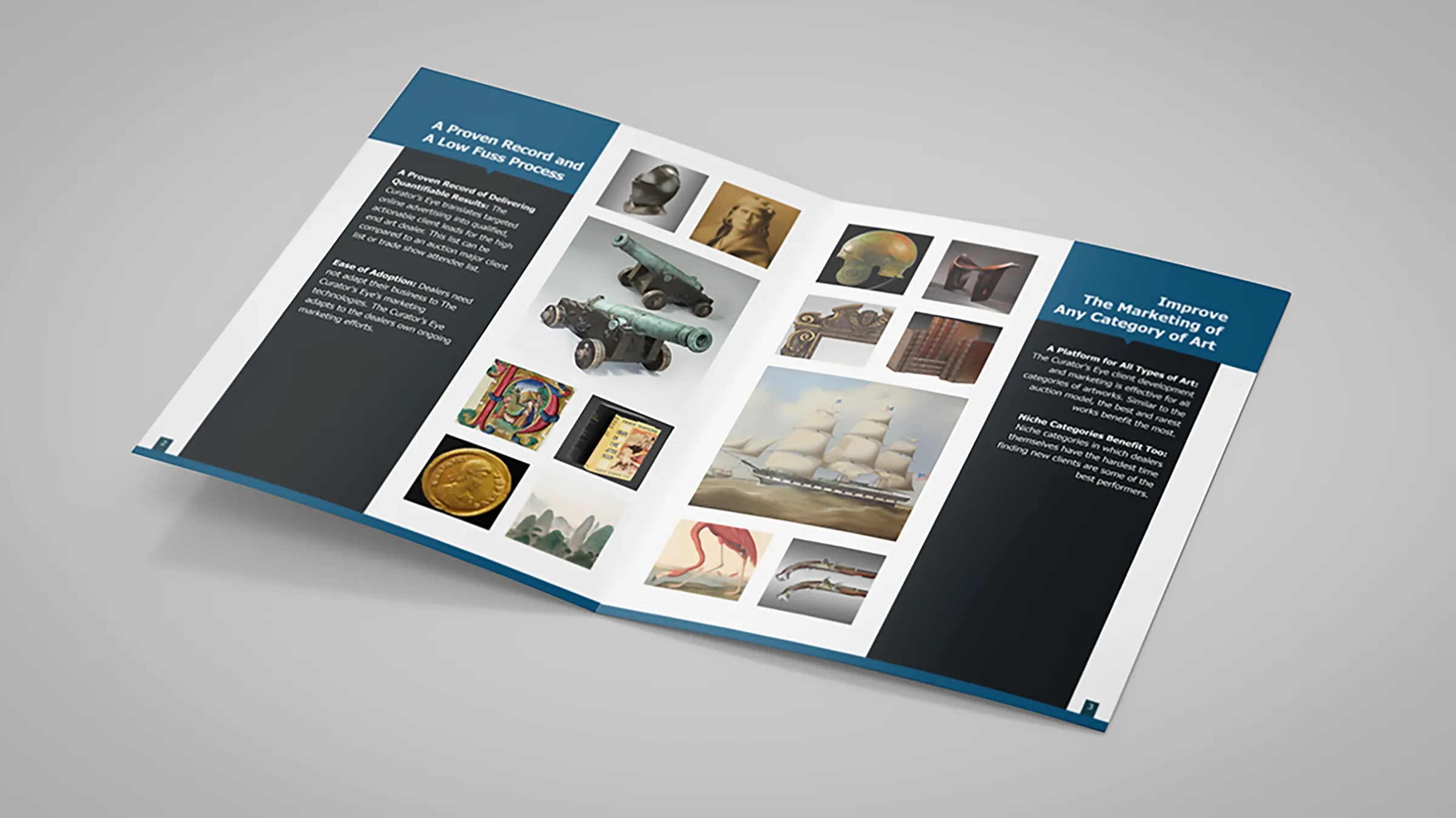
The brochure is built on one repeating structure. Each spread has a blue heading band across the top, a dark navy panel holding the running text, and a white field where the supplied diagram or a grid of objects sits. The palette of the layout is taken from the supplied graphics, navy, petrol blue and green, so the client’s material looks native to the pages rather than pasted onto them. The image grids do the opposite work to the diagrams: where the diagrams argue, the photographs of furniture, paintings, sculpture, books and jewellery show the range of what is being sold. The serif wordmark on the cover, set against the strict grid of objects, sets the tone the interior keeps.
Result
A multi-page brochure in which supplied artwork and new layout read as one piece. A dealer can follow the argument from the front cover to the self-scoring questionnaire and the cost charts near the end, and nothing on the way announces that the diagrams and the pages around them came from two different sources.