Brand identity
Motsnyi IP Group, Brand identity
Brief
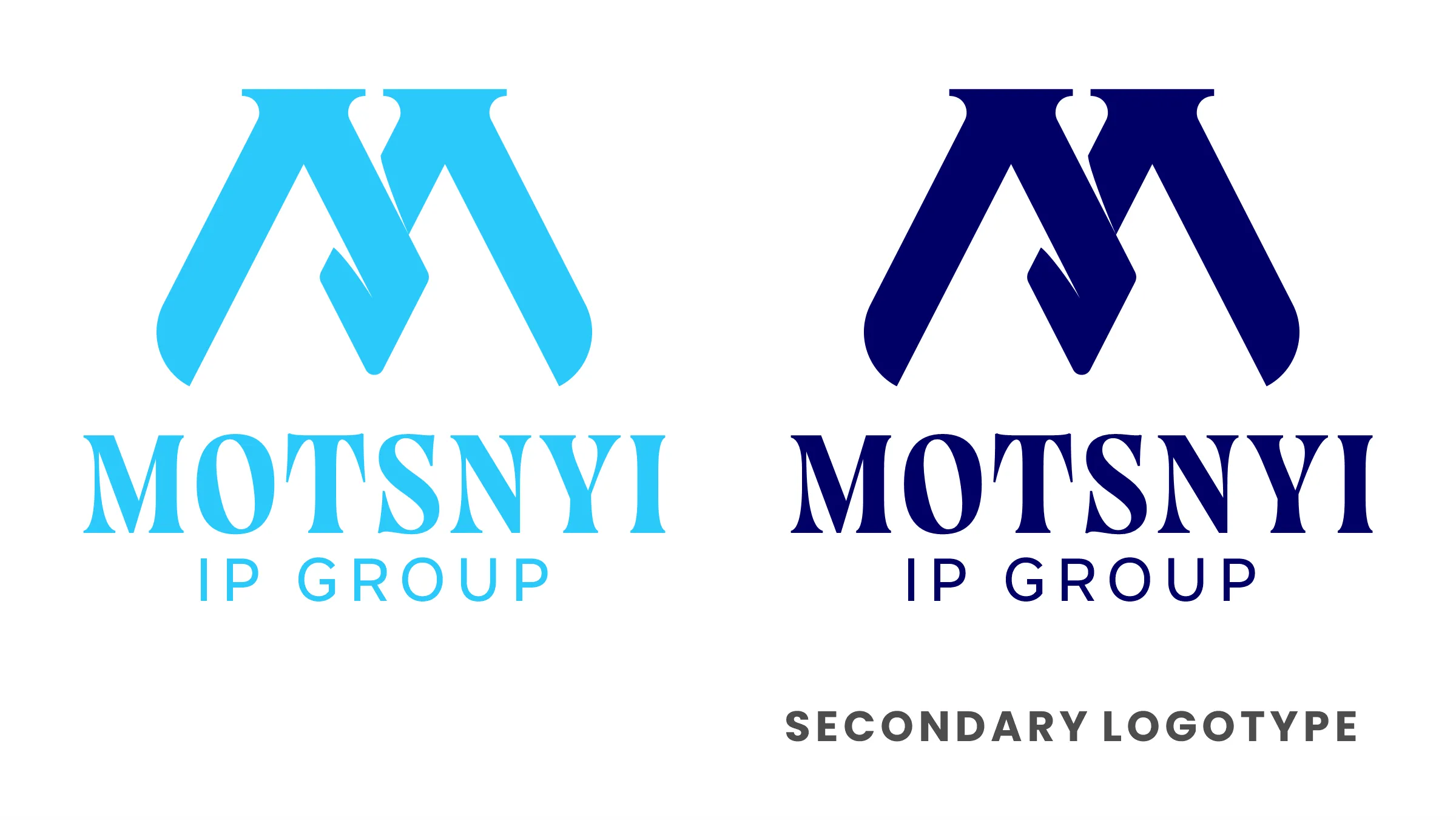
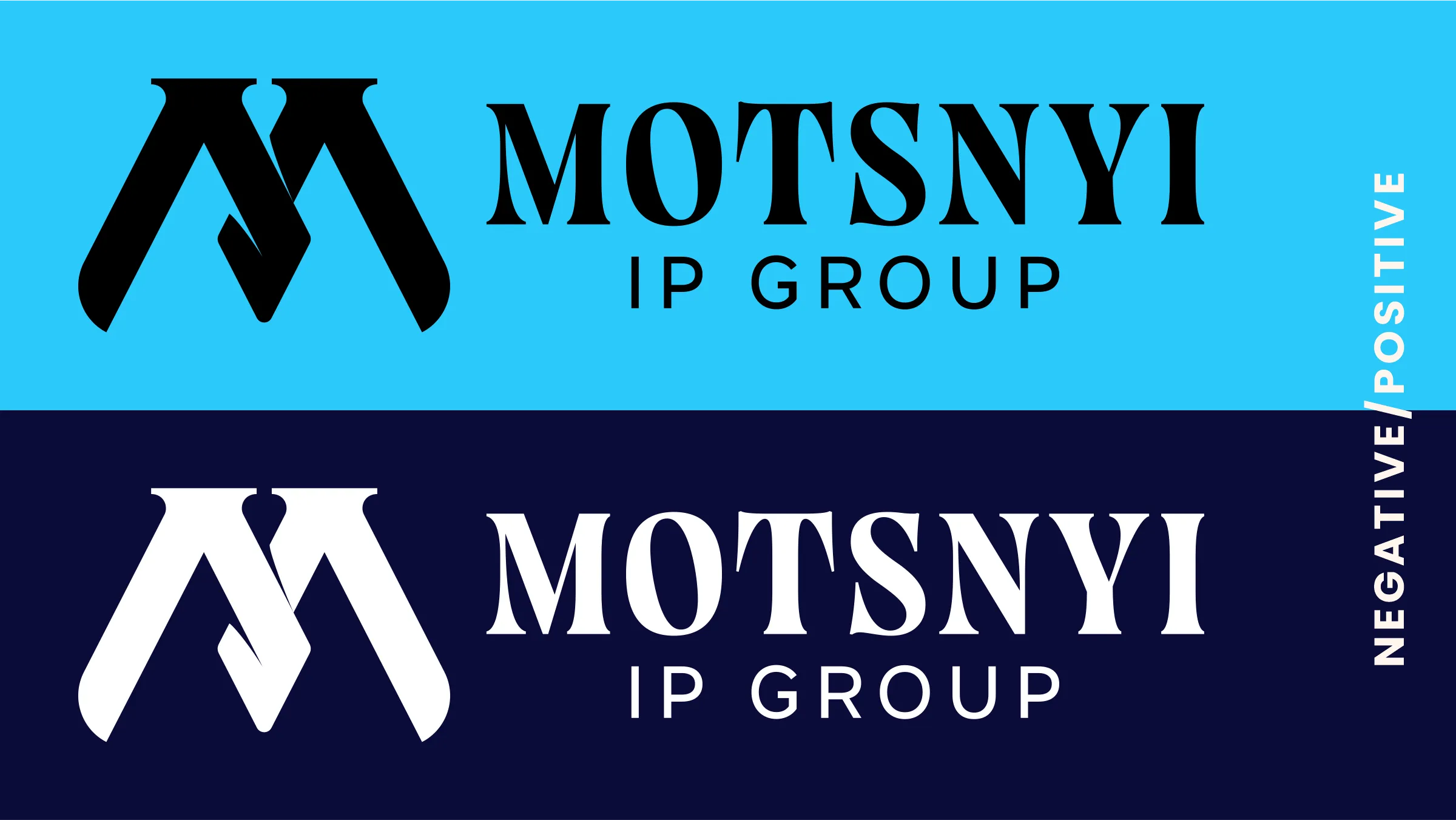
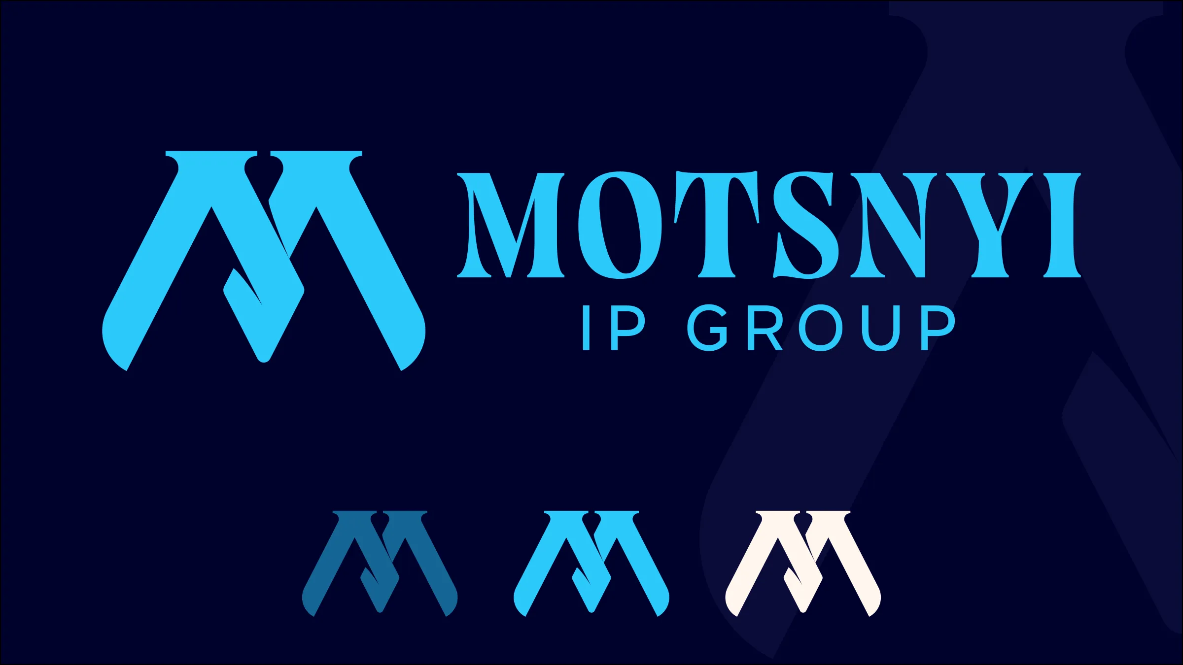
Motsnyi IP Group commissioned a complete identity rather than a single logo: a primary logotype, a secondary lockup and a standalone brandmark. All three forms were required so the brand could be applied consistently across digital channels and printed or physical promotional material. The stated objectives were recognition, memorability and straightforward application.
Approach
Development began with the brandmark rather than the wordmark. The symbol was drawn from an initial sketch and built in Illustrator, and the wordmark was then constructed around it. Motsnyi is the founder’s surname, so the typography had to carry a family name: the selected typeface is elegant but substantial, weighted to hold its own beside the mark. Primary and secondary colors were derived from the blues the brand already used, keeping the new identity in continuity with the existing one.
Result
The delivered system works in three forms: the primary logo, the secondary lockup and the brandmark on its own. All three share the same core shape, so every application, from a small digital icon to large-format print, has a suitable version without redrawing.